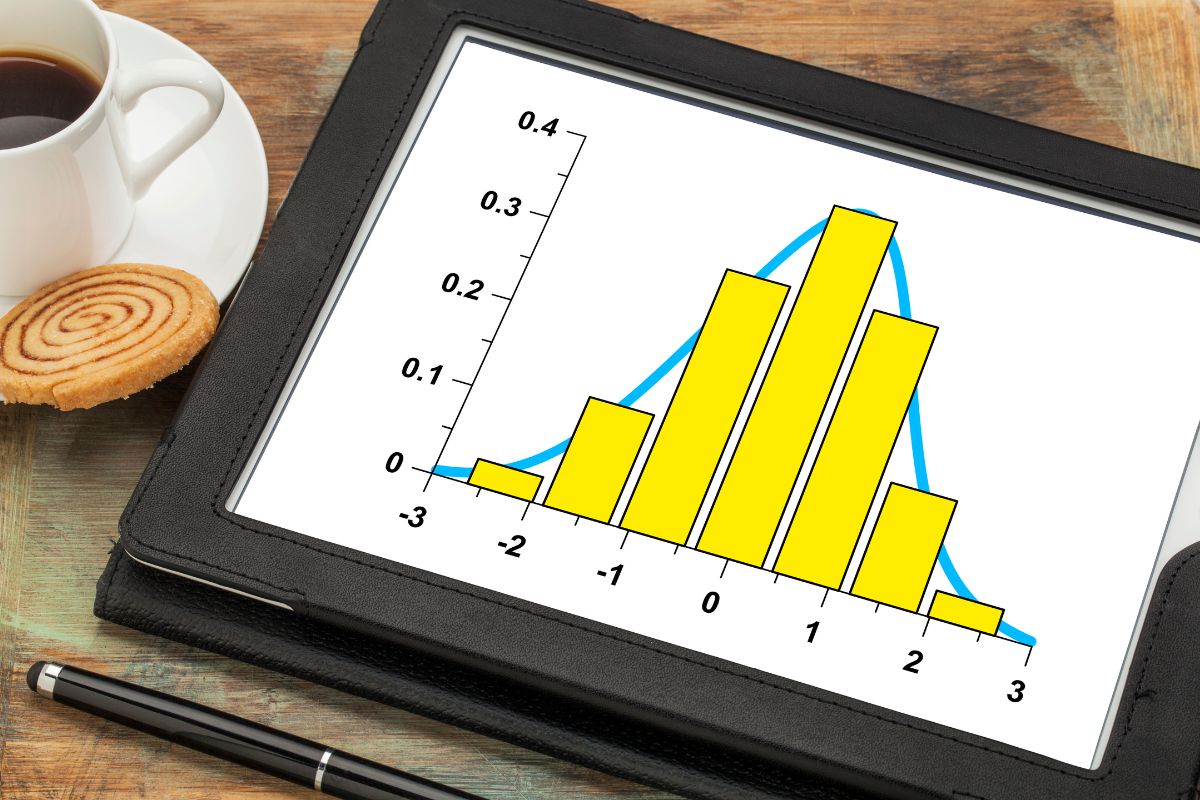
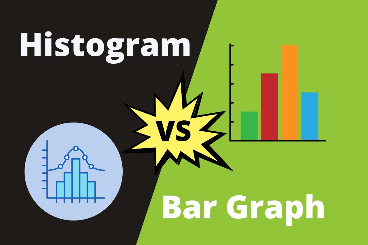
Histograms don’t have spaces in between the bars, while bar graphs have spaces in between each bar. Also, histograms are ideal for displaying the frequency of continuous data, while bar graphs are used to visually compare different variables counted over a set time.
Understanding the difference between a histogram and a bar graph is essential to making a calculative decision while displaying your data graphically. Which graph to choose will depend on whether you want to show categorized or continuous data.
Table of Contents
Histogram vs Bar Graph
| Histogram | vs | Bar Graph |
| Helpful in displaying the frequency of continuous data involving non-discrete variables. | Usage | Used to visually compare different variables counted over a predefined period of time. |
| Instead of having gaps, the bars are joined together. | Spacing | There are gaps between the bars. |
| The bar width is not the same. | Width of bars | The bar must have the same width. |
| After completion, it is difficult to rearrange the bars. | Rearrangement of bars | You can rearrange the bar blocks. |
| You can group the elements to view them as ranges. | Elements | The elements are distinct units. |
What is a Histogram?
A histogram is one type of bar chart first introduced by Karl Pearson that shows how periodically continuous quantitative data changes. The bars’ varying heights indicate that noticed frequencies are the best for visually expressing statistical information.
Since the total number of observations falls between the scope, also popularly called the bin or class, these neighboring bars join together. The horizontal X-axis displays the number of ranges of values for different groups. In contrast, the vertical Y-axis shows data values.

How to Make Histograms
You can use data visualization tools or use Excel to create this histogram. You have to follow a few regular steps listed below to make a histogram:
- You will have to draw the x-axis and the y-axis.
- Name the two axes according to your convenience.
- Number the total number of bins and then give appropriate labeling to your graph.
- To start placing the frequency ticks, you will have to divide the number of data you have by 100.
- Now, draw a rectangle on the graph representing the percentage of the total that each bin fills by first counting the number of things in each bin.
When to Use a Histogram
Since it displays how periodically the different data values occur, a histogram is best used to achieve these objectives:
- You may use it to present a lot of data that is difficult to understand in tabular form.
- Display the frequency of data together with an interval using the histogram.
- Helps in coming up with a process’s volume.
- Use it to forecast how the process will perform in the future.
What is a Bar Graph?
A bar graph (or bar chart) consists of several bar graphs that show comparisons across different data sets. It uses straight rectangular bars with variable lengths but equal widths to represent the grouped data.
Each rectangular block represents a particular set of data, and the length of the bar depends on the values it contains for different categories of data. These categories do not touch each other.
Bar graphs can be vertical or horizontal and are the best choice for displaying positive and negative values.
Vertical bar charts represent time series data, while horizontal bar charts transmit data that fluctuates across space.
A bar graph has two axes, with the other axis indicating categories and the Y-axis reflecting data values.

How to Make a Bar Graph
You have to follow the below steps to complete sketching a bar graph:
- The first step for you to do is to collect the data.
- You will now have to draw the x-axis and the y-axis.
- Start labeling the two axes.
- Then draw the rectangular bars according to the data points given to you.
- You will then be able to analyze and interpret the data easily.
When to Use a Bar Graph
Each data type shows in the bar graph as frequency distribution, and you can use it for the following advantages:
- Visually compressing a voluminous data bank.
- Whether the data is numerical or categorical, a bar graph is ideal.
- Large data sets in a graphic format make trends easier to understand than tables.
- Calculate important numbers quickly.
- Show the contour of near numbers or proportions.
Representing Data with a Few Points
Both histograms, as well as bar charts, are ideal for representing large data sets. However, a histogram best represents numerical data sets. At the same time, bar charts are suitable for representing categorical data sets separated into distinct categories.
If you’ve enjoyed this article, check out our post on condos versus apartments.

